
Appearance
Skip to content This article gives an overview of the various Vue components in the Metaplay SDK that you can use in your components.
Dependencies
This page assumes a working familiarity with Vue and the LiveOps Dashboard project. Have a look at Customizing the LiveOps Dashboard Frontend for a refresher, if needed!
Overview
The Metaplay SDK ships with an ever-growing collection of Vue components that make it much easier to create consistent and well-performing LiveOps Dashboard UI components. There are two sources of generic UI components that you can re-use in your components:
- Metaplay SDK's core components - Our custom components offer an opinionated style and layout that's specific to the LiveOps Dashboard. Under active development.
- Bootstrap Vue - An open-source library that wraps the Bootstrap 4 components and utilities into a Vue native format. They have excellent online documentation for all their components! Very stable and mature.
The MetaUI Module
All our internal dashboard core UIs heavily rely on the metaplay-sdk/MetaUi module's reusable components. You can safely use these in your components, as we will maintain them going forward and provide a migration path for any breaking changes in future SDK updates. We will also be adding new components to this module as we build out new features in the LiveOps Dashboard.
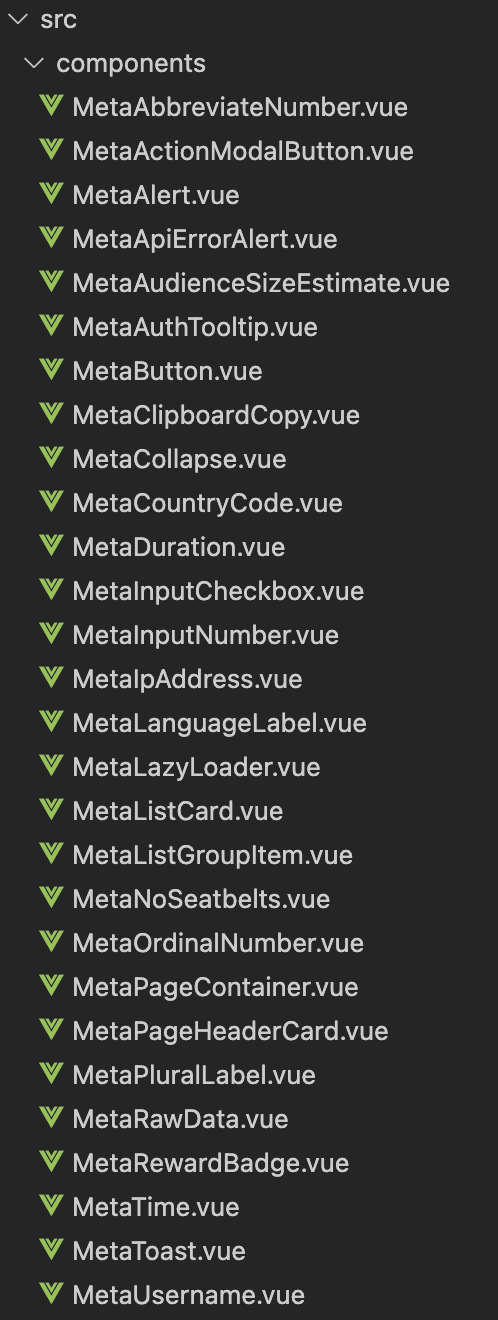
Components
For an up-to-date list of all the components in the MetaUi module, please refer to the MetaplaySDK/Backend/Dashboard/MetaUI/src/components folder. All MetaUi components are globally imported by the code SDK module, so you don't need to individually import them in your code.
The components have properties that customize their behavior and the more complex props are documented within the files themselves for easy code completion.
typescript
// Snippet from MetaButton.vue

const props = defineProps<{
  /**
   * Optional: Enables permission checks. Automatically disables the button with a tooltip if the user is missing the permission.
   */
  permission?: string
  /**
   * Optional: Variant prop that gets passed to the underlying b-button. Defaults to 'secondary' variant style and ignored if 'link' prop is true.
   */
  variant?: 'primary' | 'secondary' | 'success' | 'danger' | 'warning' | 'info' | 'light' | 'dark' | 'outline-primary' | 'outline-secondary' | 'outline-success' | 'outline-danger' | 'outline-warning' | 'outline-info' | 'outline-light' | 'outline-dark'
  /**
   * Optional: Disables the button.
   */
  disabled?: boolean
  /**
   * Optional: Size prop that gets passed to the underlying button. Ignored if the 'link' prop is true.
   */
  size?: string
  /**
   * Optional: Modal ID to open on click.
   */
  modal?: string
  /**
   * Optional: Router link to open on click.
   */
  to?: string
  ...
}>()
Alternatively, you can also refer to the source code of any of our code dashboard pages to see what components we've used (and how we've used them) to build any given feature.
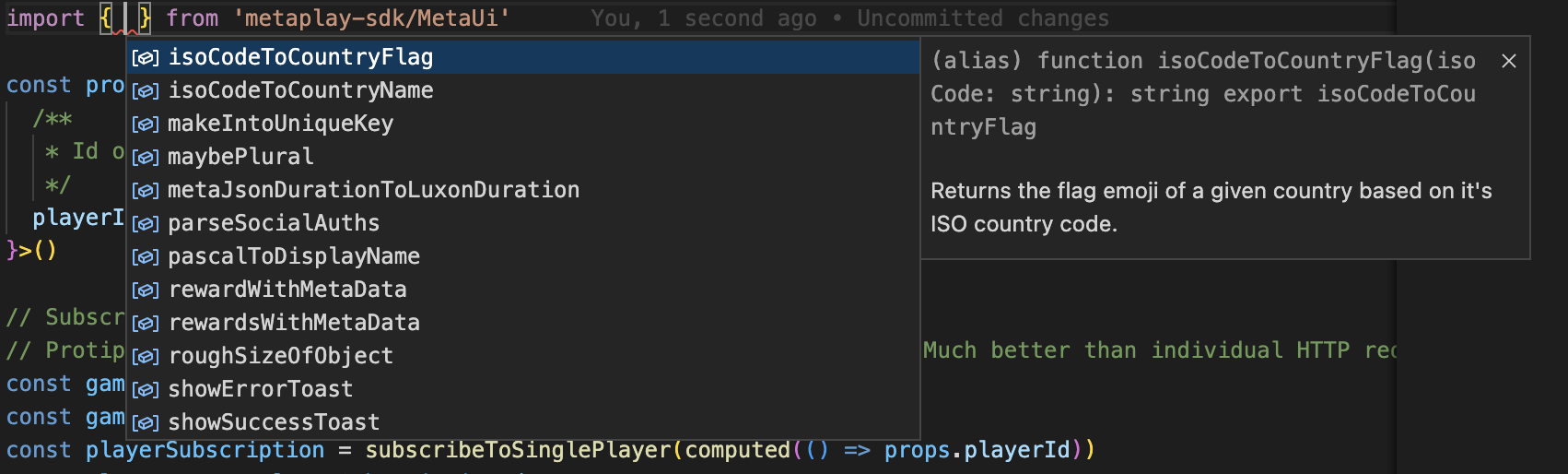
Utilities
We have also created reusable utility functions for common UI data transformations. The easiest way to see them all is to use your IDE's auto-complete feature when importing the MetaUi module.
Known Caveats
While we rely heavily on the existing meta-components and suggest you do the same, they are still under active development and some regressions may happen from time to time as we keep polishing the component interfaces.
We will try to keep breaking changes to a minimum and proactively communicate about any significant changes in the release notes, so keep an eye on them if you rely on meta-components in your project!